Dissent
Magazine and concept
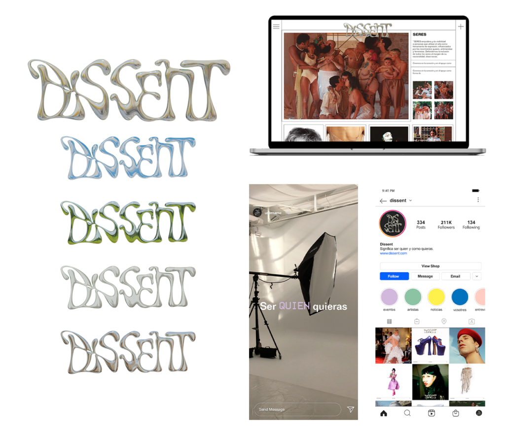
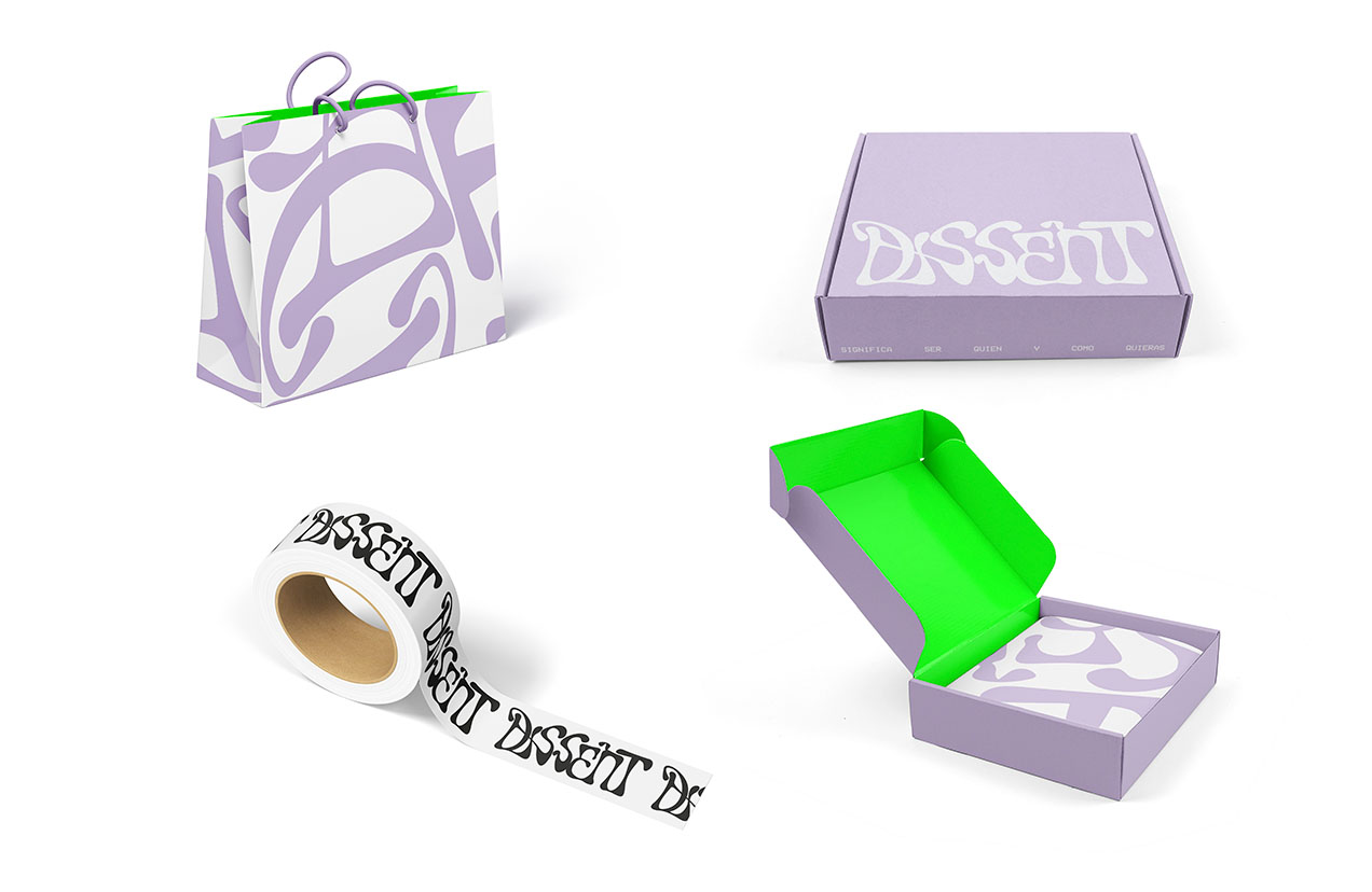
Branding
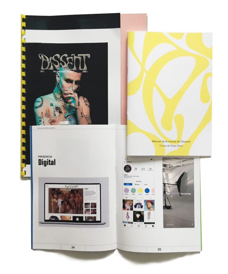
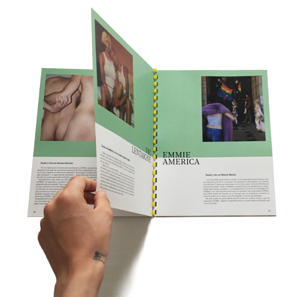
Editorial design
Dissent is a concept store that offers much more than a typical shopping experience. It is a brand that redefines gender, viewing it as a fluid spectrum beyond the traditional binary understanding of male and female.
Every aspect of Dissent has been meticulously designed and thought through, from its name to its application across physical and digital platforms, including the creation of a magazine to communicate and amplify the brand’s concept.
Dissent provides a unique global experience rooted in research on gender perceptions worldwide, incorporating foundational principles of editorial design for print magazines and employing emotional design as a catalyst for social change.
The brand’s name, Dissent, reflects its focus on gender-diverse individuals, specifically those who identify beyond the traditional male and female binary.
The word is divided into two syllables: Dis-sent. This division allows for flexibility in layout, enabling it to be split into two rows if needed.
The logo departs from a strict grid to emphasize its organic nature, rendered in 3D. We’ve incorporated the texture of molten metal to enhance its tactile quality. The malleability, resilience, and luminosity of molten metal symbolize the brand’s core values.
Within the logo, we represent qualities such as fluidity, intimacy, resilience, and unity—attributes that encapsulate the modernity and expressiveness embodied by Dissent.


